What is Color Theory? Basics for Designers and Creatives
Color theory is the study of how colors work together and how they affect us. It’s like a set of rules that help us choose colors that look good and make sense.
Whether you’re designing a website, painting a picture, or picking out clothes, understanding color theory can make your work stand out.
Quick Facts About Color Theory
- Color Wheel Basics: Primary, secondary, and tertiary colors form the foundation.
- Color Harmony: Combinations like complementary and analogous colors create balance.
- Color Psychology: Colors can influence emotions and decisions.
- Practical Uses: From branding to web design, color theory is everywhere.
The Color Wheel: The Heart of Color Theory
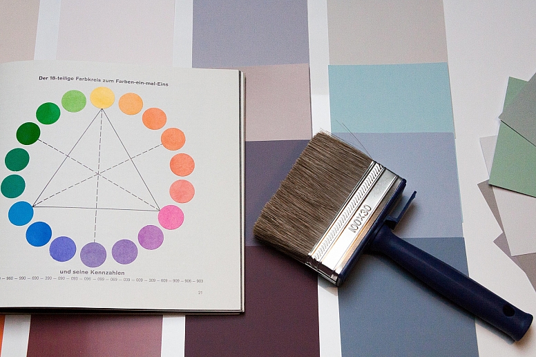
The color wheel is a circle that shows how colors relate to each other. It’s divided into three types of colors:
- Primary Colors: Red, blue, and yellow. These colors can’t be made by mixing others.
- Secondary Colors: Green, orange, and purple. These are made by mixing two primary colors.
- Tertiary Colors: Colors like red-orange or blue-green. These are made by mixing a primary and a secondary color.

The color wheel helps you see which colors look good together. For example, colors opposite each other on the wheel (like red and green) are called complementary colors and create a strong contrast.
Color Harmony: Making Colors Work Together
Color harmony is about finding colors that look good side by side. Here are some common ways to create harmony:
- Complementary Colors: Opposite on the wheel (e.g., blue and orange). They create a bold look.
- Analogous Colors: Next to each other on the wheel (e.g., blue, blue-green, and green). They feel calm and cohesive.
- Triadic Colors: Three colors evenly spaced on the wheel (e.g., red, yellow, and blue). They’re vibrant and balanced.
- Monochromatic Colors: Different shades of the same color (e.g., light blue, blue, and dark blue). They’re simple and elegant.
Using these combinations can help you create designs that feel balanced and pleasing to the eye.
Color Psychology: How Colors Make Us Feel
Colors can affect our emotions and decisions. Here’s what some colors often mean:
- Red: Energy, excitement, or danger. It grabs attention quickly.
- Blue: Calmness, trust, or professionalism. Many brands use blue to feel reliable.
- Yellow: Happiness, warmth, or caution. It’s bright and cheerful.
- Green: Nature, growth, or health. It’s often used for eco-friendly brands.
Think about how you want people to feel when they see your work. For example, a calming blue might work well for a meditation app, while a bold red could be perfect for a fast-food logo.
Using Color Theory in Real Life
Color theory isn’t just for artists. It’s used in many fields:
- Branding: Companies choose colors that reflect their values. For example, green is often used for eco-friendly brands.
- Web Design: Colors help guide users’ eyes and make websites easy to navigate.
- Interior Design: Colors can make a room feel cozy, spacious, or energetic.
Here’s a quick example: Imagine you’re designing a logo for a coffee shop. You might choose warm browns and creams to reflect the cozy feeling of drinking coffee.
Tips for Using Color Theory
- Start with the color wheel to find combinations that work.
- Use tools to test and refine your palettes.
- Think about the mood you want to create. Bright colors feel energetic, while muted colors feel calm.
- Don’t be afraid to experiment. Sometimes, unexpected combinations work best.
Why Color Theory Matters
Understanding color theory helps you make better decisions about color. It’s not just about making things look pretty—it’s about communicating ideas and emotions. Whether you’re designing a poster, decorating a room, or creating a website, color theory gives you the tools to succeed.
Ready to Try It Out?
Now that you know the basics of color theory, why not put it into practice? Use tools like Colorik to create your own color palettes and see how different combinations work together. The more you experiment, the better you’ll get.
Frequently Asked Questions
1. What are the primary colors?
The primary colors are red, blue, and yellow. They can’t be made by mixing other colors.
2. What’s the difference between complementary and analogous colors?
Complementary colors are opposite on the color wheel and create contrast. Analogous colors are next to each other and feel harmonious.
3. How do I choose colors for a logo?
Think about the emotions you want to convey. For example, blue feels trustworthy, while yellow feels cheerful.
4. Can I use more than three colors in a design?
Yes, but it’s best to stick to a few main colors to keep your design balanced.
5. What’s the best way to learn color theory?
Start with the color wheel and experiment with different combinations. Tools can help you practice.
By understanding color theory, you can create designs that not only look great but also communicate the right message. So grab your color wheel and start experimenting!

